Logo & Identity

Logo and identity work developed for farms, events, and small brands. These projects focused on building clear, adaptable marks that could work across print, apparel, signage, and merchandise.

← Back to Portfolio

Phillips Livestock logo design

Phillips Livestock

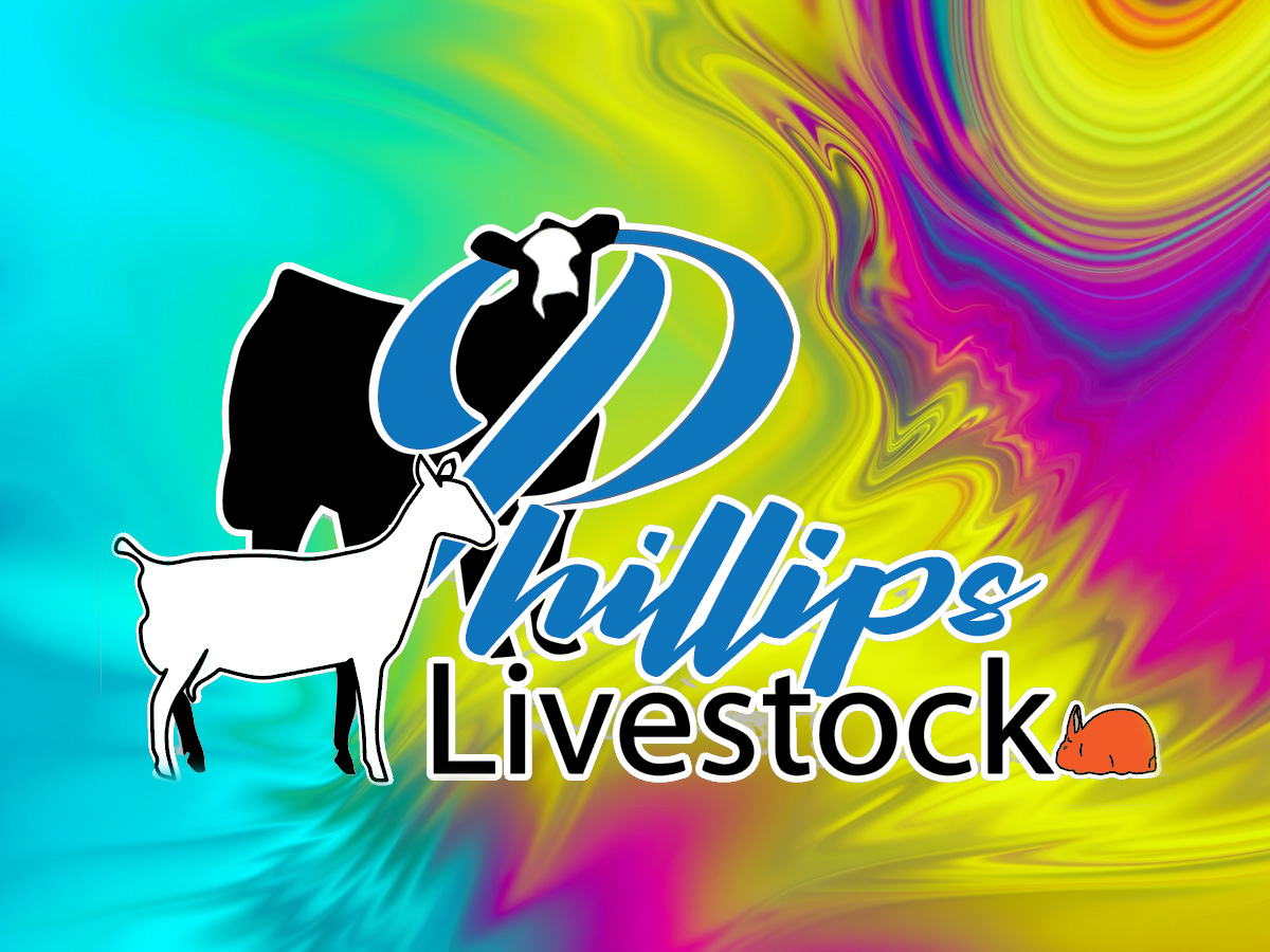
Livestock Brand Mark

This logo was developed as a clean, bold identity for an agricultural brand. The final mark combines simplified livestock silhouettes with strong typography to create a design that reads clearly at both small and large scale.

Projects like this are often built from an initial concept or rough direction provided by the client, then refined into a more balanced and production-ready design. In this case, the work focused on improving composition, clarifying the animal forms, and creating a layout that could reproduce cleanly for signs, apparel, decals, and other farm branding uses.

The finished logo was designed to remain legible in single-color applications, which is especially important for vinyl, embroidery, screen printing, and other practical branding uses common in agricultural businesses.

Tavern Con 2016 event logo and shirt graphics

Tavern Con 2016

Event Identity & Apparel Graphics

This event identity was developed for Tavern Con 2016, combining logo design with merchandise graphics used for conference apparel. The visual direction draws from Celtic ornament and fantasy-inspired motifs to create a distinctive mark suited to the event’s theme. The core identity centers around a pair of stylized drinking vessels surrounded by knotwork patterns, establishing the tavern motif while maintaining a balanced circular composition. A secondary emblem featuring a dragon crest provided an additional graphic element for merchandise and promotional materials. The artwork was designed with screen printing in mind, using controlled line weight and a limited color palette to ensure reliable reproduction on apparel. The final system allowed the identity to appear across multiple shirt designs while remaining visually consistent. Projects like this demonstrate how logo design for events often extends into a broader visual system, where the mark must function not only as a symbol but also as part of merchandise and promotional graphics.

Projects like this sit at the intersection of logo work, illustration, and merchandise design. The goal is not just to create an emblem, but to develop a visual identity that can live comfortably across apparel and promotional pieces.

Magenta Monkey Studio logo design

MMC Arts Branding Evolution

Studio Identity Development

Over the past two decades my personal studio branding has evolved through several iterations as the focus of my work expanded. Early versions of the brand centered around the character-driven identity of Magenta Monkey Studio, which emphasized illustration and playful visual elements.

As the studio developed, the branding shifted toward a more flexible identity that could support a wider range of creative work including fine art, graphic design, editorial layout, and commercial production. This transition eventually led to the MMC Arts identity.

Each stage of the brand reflects a different period of the studio’s development, moving from character-based artwork toward a more refined typographic identity. The process illustrates how branding can evolve over time while still maintaining recognizable visual elements and creative personality.

Projects like this demonstrate the long-term nature of identity design, where brands grow and adapt alongside the work and audiences they serve.

← Back to Portfolio